Pipeline theme version 6 to 7
Simple CSS changes
To add any CSS code in this list follow these steps: Where to add CSS
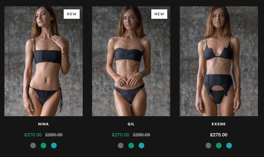
- Solid Color for Add to cart button
a. Quick add and quick view buttons color - Hide Add to cart button price
- Hide navigation cart link
- Solid background-color for header when scrolling
- Overriding the theme font
- Change color of size chart link
- Sticky currency and language selectors
- Use initial case for all text
- Change background-color and roundness of variant radio labels
- Borderless product page image on mobile
- Always show grid swatches
- Add drop-down arrow indicators to top-level menus
- Larger swatches on product page
Advanced Changes
May require Liquid, CSS and Javascript changes
- Show cart drawer when product added to cart - for pipeline 6.1 and above
- Add SKU to product section with the Liquid block
- Show native quantity selector for quantity input
- Show payment types below add to cart button
- Scroll to top button
- Sticky add to cart - scroll to add to cart button
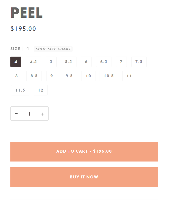
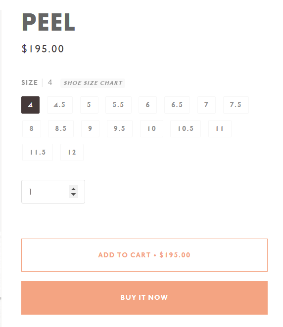
1. Solid Color for Add to cart button
This allows the add to cart button to use the primary accent color
/* CSS - change Add to Cart button color */
.product-clip__btn,
.product__submit__buttons .btn--add-to-cart {
  background-color: var(--COLOR-PRIMARY);
  border: 1px solid var(--COLOR-PRIMARY);
  color: var(--COLOR-PRIMARY-OPPOSITE);
}
.product-clip__btn:hover, .product-clip__btn:focus,
.product__submit__buttons .btn--add-to-cart:hover, .product__submit__buttons .btn--add-to-cart:focus {
  background-color: var(--COLOR-PRIMARY-HOVER);
  border: 1px solid var(--COLOR-PRIMARY-HOVER);
  color: var(--COLOR-PRIMARY-OPPOSITE);
}
/* Change loading and complete state colors */
.btn-state-loading .svg-loader circle,
.btn-state-loading .svg-loader circle~circle{
  stroke: var(--COLOR-PRIMARY-OPPOSITE);
}
.btn-state-complete{
    border-left: 2px solid var(--COLOR-PRIMARY-OPPOSITE);
    border-bottom: 2px solid var(--COLOR-PRIMARY-OPPOSITE);
}
/* - end - */
To use custom colors instead of the primary theme color also add this CSS code. Use any valid hex color for the properties
/* CSS - custom colors Add to Cart button
--COLOR-PRIMARY  - the background color
--COLOR-PRIMARY-HOVER  - the hover background color
--COLOR-PRIMARY-OPPOSITE - the text color
*/
.product__submit__buttons .btn--add-to-cart {
  --COLOR-PRIMARY: #444444;
  --COLOR-PRIMARY-HOVER: #111111;
  --COLOR-PRIMARY-OPPOSITE: #ffffff;
}
/* - end - */
/* CSS - change Add to Cart button color */
.upsell__btn,
.product__submit__buttons .btn--add-to-cart {
  background-color: var(--COLOR-PRIMARY);
  border: 1px solid var(--COLOR-PRIMARY);
  color: var(--COLOR-PRIMARY-OPPOSITE);
}
.upsell__btn:hover, .upsell__btn:focus,
.product__submit__buttons .btn--add-to-cart:hover, .product__submit__buttons .btn--add-to-cart:focus {
  background-color: var(--COLOR-PRIMARY-HOVER);
  border: 1px solid var(--COLOR-PRIMARY-HOVER);
  color: var(--COLOR-PRIMARY-OPPOSITE);
}
/* Change loading and complete state colors */
.btn-state-loading .svg-loader circle,
.btn-state-loading .svg-loader circle~circle{
  stroke: var(--COLOR-PRIMARY-OPPOSITE);
}
.btn-state-complete{
    border-left: 2px solid var(--COLOR-PRIMARY-OPPOSITE);
    border-bottom: 2px solid var(--COLOR-PRIMARY-OPPOSITE);
}
/* - end - */
To use custom colors instead of the primary theme color also add this CSS code. Use any valid hex color for the properties
/* CSS - custom colors Add to Cart button
--COLOR-PRIMARY  - the background color
--COLOR-PRIMARY-HOVER  - the hover background color
--COLOR-PRIMARY-OPPOSITE - the text color
*/
.product__submit__buttons .btn--add-to-cart {
  --COLOR-PRIMARY: #444444;
  --COLOR-PRIMARY-HOVER: #111111;
  --COLOR-PRIMARY-OPPOSITE: #ffffff;
}
/* - end - */
/* CSS - change Add to Cart button color */
.upsell__btn,
.product__submit__buttons .btn--add-to-cart {
  background-color: var(---color-primary);
  border: 1px solid var(---color-primary);
  color: var(---color-primary-opposite);
}
.upsell__btn:hover, .upsell__btn:focus,
.product__submit__buttons .btn--add-to-cart:hover, .product__submit__buttons .btn--add-to-cart:focus {
  background-color: var(---color-primary-hover);
  border: 1px solid var(---color-primary-hover);
  color: var(---color-primary-opposite);
}
/* Change loading and complete state colors */
.btn-state-loading .svg-loader circle,
.btn-state-loading .svg-loader circle~circle{
  stroke: var(---color-primary-opposite);
}
.btn-state-complete{
    border-left: 2px solid var(---color-primary-opposite);
    border-bottom: 2px solid var(---color-primary-opposite);
}
/* - end - */
To use custom colors instead of the primary theme color also add this CSS code. Use any valid hex color for the properties
/* CSS - custom colors Add to Cart button
---color-primary  - the background color
---color-primary-hover  - the hover background color
---color-primary-opposite - the text color
*/
.product__submit__buttons .btn--add-to-cart {
  ---color-primary: #444444;
  ---color-primary-hover: #111111;
  ---color-primary-opposite: #ffffff;
}
/* - end - */
Example when this is used
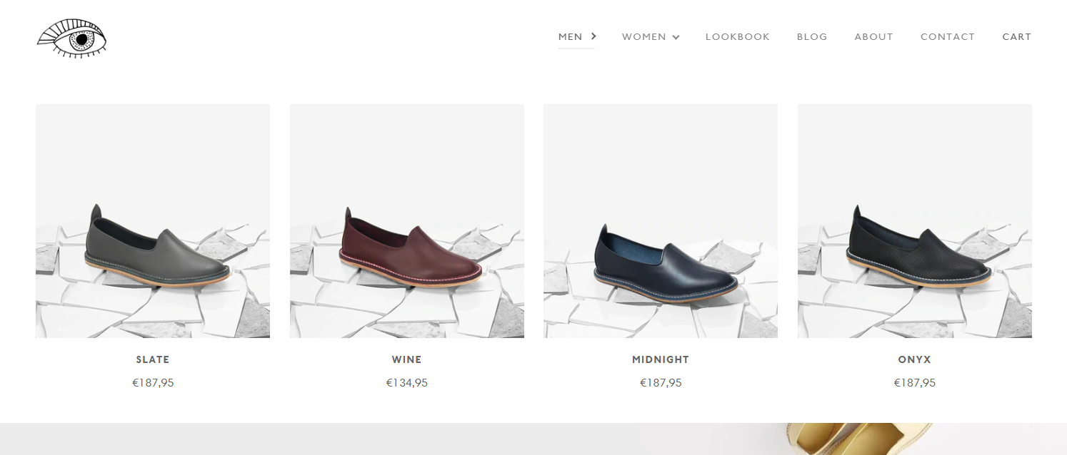
a. Quick add and quick view buttons color
/* change quick add and quick view buttons color */
.product-grid-item__content .bg-button{
  background-color: var(--COLOR-PRIMARY);
}
.product-grid-item__content .bg-button .text-button-contrast{
  color:var(--COLOR-PRIMARY-OPPOSITE)
}
.product-grid-item__content .bg-button:hover, .product-grid-item__content .bg-button:focus{
  background-color: var(--COLOR-PRIMARY);
}
/* change quick add and quick view buttons color */
.product-grid-item__actions{
  --text-light: var(--COLOR-PRIMARY-OPPOSITE);
  --COLOR-BADGE: var(--COLOR-PRIMARY);
  --COLOR-BADGE-TEXT: var(--COLOR-PRIMARY-OPPOSITE);
}
.product-grid-item__actions:hover, .product-grid-item__actions:focus{
  --COLOR-BADGE: var(--COLOR-PRIMARY-HOVER);
}
.product-grid-item__btn:hover, .product-grid-item__btn:focus{
  --COLOR-BADGE-TEXT-HOVER: var(--COLOR-PRIMARY-OPPOSITE);
}
.inline-add-product__options-menu-list-item-button{
  --COLOR-BADGE-TEXT: var(--COLOR-PRIMARY-OPPOSITE);
}
.inline-add-product__options-menu-list-item-button:hover, .inline-add-product__options-menu-list-item-button:focus{
  --COLOR-BADGE-TEXT-HOVER: var(--COLOR-PRIMARY-HOVER);
}
Example when this is used
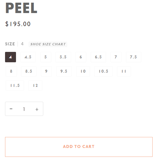
2. Hide Add to cart button price
/* CSS - hide Add to Cart button price */
.btn--add-to-cart .btn-state-ready span:not([data-add-to-cart-text]){
  display:none;
}
/* end */
Example when this is used
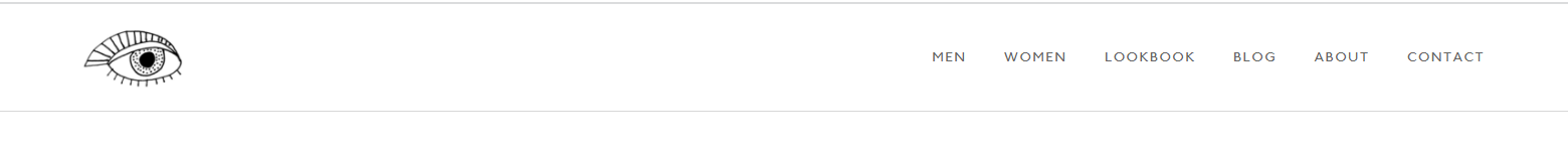
3. Hide navigation cart link
/* CSS - hide navigation cart link */
.header__desktop__button .navlink--cart,
.header__mobile__button[data-drawer-toggle="drawer-cart"]{
  display: none;
}
/* end */
Example when this is used
4. Solid background-color for header when scrolling
/* CSS - solid background-color header */
.js__header__stuck .theme__header:after {
    opacity: 1 !important;
}
/* end */
5. Overriding the theme font
a. Uploading the custom font
Convert to web font WOFF and WOFF2 if in other formats.
Upload the font files to Content > Files.
Use the links from files in the code for the URL.
Example of the font-face import code.
@font-face{
  font-family:"Gotham";
  src:url('https://cdn.shopify.com/s/files/1/0611/7824/9366/files/font.woff2?v=1661161539') format("woff2"),
  url('https://cdn.shopify.com/s/files/1/0611/7824/9366/files/font.woff?v=1661161539')format("woff");
}
b. Overriding the theme font
Add this CSS below the @font-face code. The 'Gotham' is only an example in this code sample. Modify the code to use your custom font-family.
The variables with "--font-stack-" can be updated for the body, heading, and accent. For more specific elements different CSS code would be needed.
:root {
  ---font-stack-body: 'Gotham', sans-serif;
  ---font-stack-heading:  'Gotham', sans-serif;
  ---font-stack-accent:  'Gotham', sans-serif;
}
:root {
  --FONT-STACK-BODY: 'Gotham', sans-serif;
  --FONT-STACK-HEADING:  'Gotham', sans-serif;
  --FONT-STACK-ACCENT:  'Gotham', sans-serif;
}
:root {
  --FONT-STACK-BODY: 'Gotham', sans-serif;
  --FONT-STACK-HEADING:  'Gotham', sans-serif;
  --FONT-STACK-ACCENT:  'Gotham', sans-serif;
  --FONT-WEIGHT-NAV:  'Gotham', sans-serif;
}
:root {
  --FONT-STACK-BODY: 'Gotham', sans-serif;
  --FONT-STACK-HEADING: 'Gotham', sans-serif;
  --FONT-STACK-ACCENT: 'Gotham', sans-serif;
  --TYPE-STACK-NAV: 'Gotham', sans-serif;
  --TYPE-STACK-BUTTON: 'Gotham', sans-serif;
  --TYPE-STACK-KICKER: 'Gotham', sans-serif;
}
c. Use system fonts
Change to system fonts if you don't need to use a specific font in the theme settings.
System fonts are fonts that are already installed on a user’s computer. This removes the need for browsers to download the font.
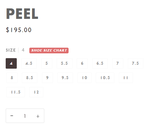
6. Change color of size chart link
You can update the background-color and color properties with any valid HEX color code.
To find additional HEX color codes, visit: https://colorhunt.co
/* CSS - change color of size chart link */
.product__info__link--inline,
.product__info__link{
  background-color: #d02e2e;
  color: #ffffff;
}
/* end */
For the link hover color
/* CSS - change hover color of size chart link */
.product__info__link--inline:hover,
.product__info__link:hover{
  background-color: #ffffff;
  color: #d02e2e;
}
/* end */
Example when this is used
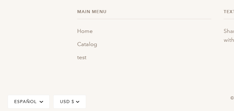
7. Sticky currency and language selectors
Use this to apply the change to both desktop and mobile
/* CSS - Sticky currency and language selectors */
#localization-form-footer{
  position: fixed;
  z-index: 1000;
  bottom: 0px;
  left: 15px;
}
#localization-form-footer .popout-list,
#localization-form-footer .popout__toggle{
  background: #ffffff;
  color: #000;
}
#localization-form-footer .popout__toggle{
  border: 1px solid #f0f0f0;
}
#localization-form-footer .popout-list__item a{
  color: #000;
}
/* end */
Use this to apply the change only to desktop
/* CSS - Sticky currency and language selectors desktop */
@media only screen and (min-width: 480px){
  #localization-form-footer{
    position: fixed;
    z-index: 1000;
    bottom: 0px;
    left: 15px;
  }
  #localization-form-footer .popout-list,
  #localization-form-footer .popout__toggle{
    background: #ffffff;
    color: #000;
  }
  #localization-form-footer .popout__toggle{
    border: 1px solid #f0f0f0;
  }
  #localization-form-footer .popout-list__item a{
    color: #000;
  }
}
/* end */
Example when this is used
8. Use initial case for all text
This will force text to use normal letter case.
/* CSS - Use initial text transform for all text */
.announcement__more, .announcement__text, .announcement__text p, .rte.icon__bar__paragraph p,
.footer-quicklinks, .footer-secondary, .breadcrumb, .navtext, .sliderow, .uppercase, .home--uppercase, .home__subtitle,
.grid__title, .icon__column__heading, .product__grid__title, .standard__kicker, .product__info__link--inline,
.radio__legend__label, .shopify-payment-button .shopify-payment-button__button--unbranded,
.accordion__title, .collection__filters__toggle, .popout--navbar .popout__toggle, .share__text,
.product__badge, .subcollection__title, .sidebar__item a, .sidebar__item span, .popout-list__option,
.tabs--pill>.tab-link, .hero__kicker, .play__button--text, .caps--link{
  text-transform: initial !important;
}
:root{
    ---font-heading-caps: initial;
}
/* end */
/* CSS - Use initial text transform for all text */
.announcement__more, .announcement__text, .announcement__text p, .rte.icon__bar__paragraph p,
.footer-quicklinks, .footer-secondary, .breadcrumb, .navtext, .sliderow, .uppercase, .home--uppercase, .home__subtitle,
.grid__title, .icon__column__heading, .product__grid__title, .standard__kicker, .product__info__link--inline,
.radio__legend__label, .shopify-payment-button .shopify-payment-button__button--unbranded,
.accordion__title, .collection__filters__toggle, .popout--navbar .popout__toggle, .share__text,
.product__badge, .subcollection__title, .sidebar__item a, .sidebar__item span, .popout-list__option,
.tabs--pill>.tab-link, .hero__kicker, .play__button--text, .caps--link{
  text-transform: initial !important;
}
:root{
    --FONT-HEADING-CAPS: initial;
}
/* end */
/* CSS - Use initial text transform for all text */
:root {
    --FONT-NAV-TRANSFORM: initial;
    --FONT-ACCENT-TRANSFORM: initial;
    --FONT-KICKER-TRANSFORM: initial;
    --FONT-BUTTON-TRANSFORM: initial;
}
/* end */
9. Change background-color and roundness of variant radio labels
Update the --background-color and --color properties to any valid HEX code.
/* CSS - Change background-color and roundness of variant radio labels */
.radio__fieldset .radio__button{
  --background-color: #f9f9f9;
  --color: #1b1546;
}
.radio__fieldset .radio__button input~label {
    background-color: var(--background-color);
    color: var(--color);
}
/* When the radio button is checked */
.radio__fieldset .radio__button input:checked~label {
    background-color: var(--color);
    color: var(--background-color);
    border-color: var(--background-color);
}
/* When the radio button is hover */
.radio__fieldset .radio__button label:active, .radio__fieldset .radio__button label:focus, .radio__fieldset .radio__button label:hover {
    background-color: var(--background-color);
    color: var(--color);
    opacity: 0.7;
}
Add this to make the labels round
/* Make button round */
.radio__fieldset .radio__button label{
    border-radius: 25px;
}
/* end */
Example when this is used
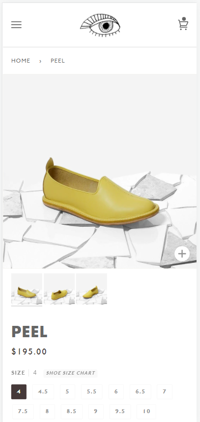
10. Borderless product page image on mobile
/* CSS - Borderless product page image on mobile */
@media only screen and (max-width: 480px) {
  .product__media > div{
    width: 100% !important;
  }
  .product-page{
    padding-top: 0;
  }
  .product-page > .wrapper {
      padding: 0;
  }
  .product-single{
    margin-left: 0;
  }
  .product-single > .grid__item{
    padding-left: 0;
  }
  .breadcrumb,
  .media__thumb__wrapper {
     margin: 0 var(--gutter) 0 var(--gutter);
  }
  .product-single > .grid__item:not(.product__media__wrapper){
     padding: 0 var(--gutter);
  }
}
/* end */
Example when this is used
11. Always show grid swatches
Hide the colors available text and show the swatches on desktop.
/* CSS - Always show grid swatches */
.product-grid-item .grid__swatch__container .grid__swatch__placeholder {
    display: none;
}
.product-grid-item .grid__swatch__container .grid__swatch__hover {
    visibility: visible;
    opacity: 1;
    height: initial;
    top: 0;
}
/* end */
Example when this is used
12. Add drop-down arrow indicators to top-level menus
/* CSS - code to add dropdown arrows in top-level navigation - */
.header__desktop .navlink--toplevel:not(:only-child) .navtext:after {
  content: '';
  position: relative;
  top: -1px;
  width: 0.5em;
  height: 0.5em;
  display: inline-block;
  vertical-align: middle;
  border-left: 0.15em solid currentColor;
  border-bottom: 0.15em solid currentColor;
  transform: rotate(-45deg);
  margin-left: 8px;
  margin-top: -0.25em;
}
.header__desktop [aria-expanded="true"] .navlink--toplevel:not(:only-child) .navtext:after,
.header__desktop .navlink--toplevel:hover:not(:only-child) .navtext:after {
  transform: rotate(-135deg);
  transition: 0.2s all;
}
/* - end - */
Example with the default code:
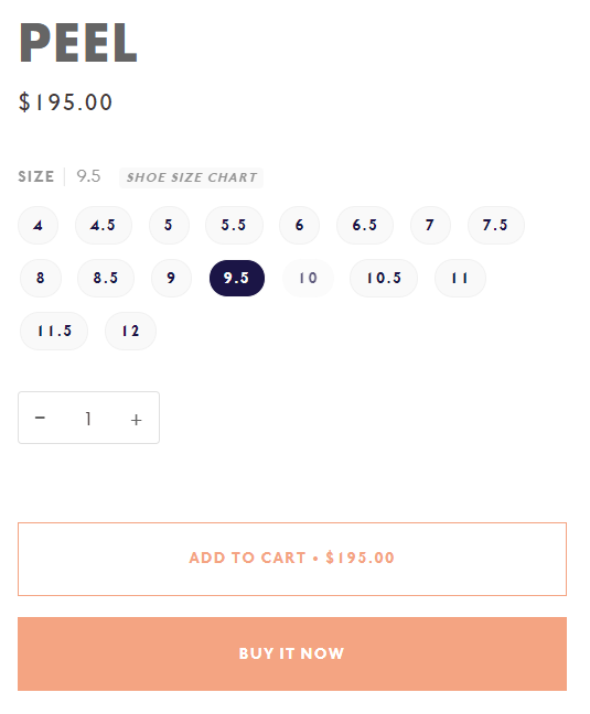
13. Larger swatches on product page
Update the --width to change the size of the image.
/* CSS - Increase the size of the swatches on the product page  - */
.product-page .swatch__button {
  --width: 38px;
  --height: var(--width);
  --offset: 4px;
}
.product-page .swatch__button label {
  width: var(--width);
  height: var(--height);
}
.product-page .swatch__button input:checked ~ label::after {
  width: calc(var(--width) + var(--offset) * 2);
  height: calc(var(--height) + var(--offset) *2);
  top: calc(var(--offset) * -1);
  left: calc(var(--offset) * -1);
  border: 2px solid var(--primary);
}
/* - end - */
Advanced Changes
1. Show cart drawer when product added to cart
/* CSS - Hide the product add popdown */
.product-add-popdown{
  display: none !important;
}
/* end */
Add this to the end of your theme.js javascript file
/* Javascript - Show cart drawer when product added to cart */
document.addEventListener('theme:cart:popdown', (e) => {
  const listener = (e) => {
    document.querySelector('[data-drawer="drawer-cart"]').dispatchEvent(
      new CustomEvent('theme:drawer:open', {
        bubbles: false,
      })
    );
    document.removeEventListener('theme:cart:change', listener);
  };
  document.addEventListener('theme:cart:change', listener);
});
/* end */
Example when this is used
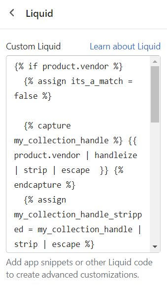
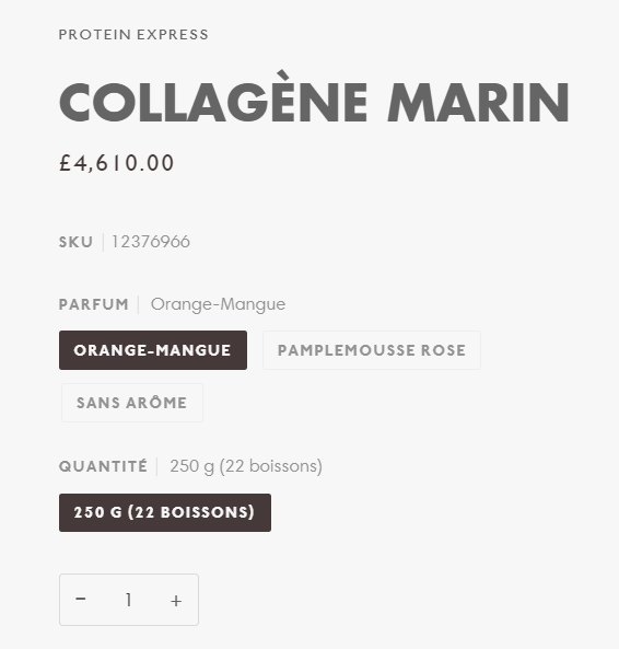
2. Add SKU to product section
Add the code below to the Liquid section block on the product page
<!-- Liquid - Add product SKU -->
{% assign current_variant = product.selected_or_first_available_variant %}
<p class="sku-wrapper radio__legend"><span class="radio__legend__label" {% if current_variant.sku == "" %}style="display:none;" {% endif %}>SKU</span><span class="variant-sku">{{ current_variant.sku }}</span></p>

<script>
  document.addEventListener('theme:variant:change', function(event) {
    const variant = event.detail.variant;
    let container = event.target;

    if(event.target.outerWrapper){
      container = event.target.outerWrapper;
    }

    const skuWrapper = container.querySelectorAll(".sku-wrapper");

    if (skuWrapper.length) {
      skuWrapper.forEach((element) => {
        const sku = element.querySelector(".variant-sku");
        if (variant) {
          if (variant.sku) {
            if(sku) {
              sku.innerHTML = variant.sku;
            }
            element.style.display = "block"
          } else {
            element.style.display = "none";
          }
        } else {
          element.style.display = "none";
        }
      });
    }
  });
</script>
<!-- end SKU -->
Example when this is used
3. Show native quantity selector for quantity input
This allows the quantity selector to use the min/max/step attributes.
/* CSS - Show native quantity selection for quantity input*/
.quantity__button{
  display: none;
}
.quantity__input{
  text-align: left;
  padding: 8px 10px;
}
input[type=number],
input[type=number]::-webkit-inner-spin-button,
input[type=number]::-webkit-outer-spin-button {
   opacity: 1 !important;
  -webkit-appearance: auto !important;
  -moz-appearance auto !important;
}
/* end */
Example when this is used
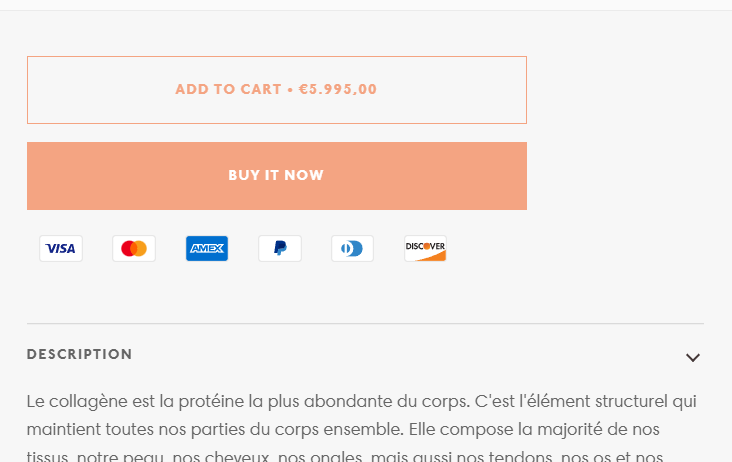
4. Show payment types below add to cart button
Add the code below to the Liquid section block on the product page.
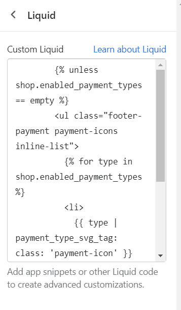
<!-- Liquid - Add payment types -->
{% unless shop.enabled_payment_types == empty %}
<ul class="footer-payment payment-icons inline-list">
  {% for type in shop.enabled_payment_types %}
  <li>
    {{ type | payment_type_svg_tag: class: 'payment-icon' }}
    <span class="visually-hidden">{{ type | capitalize | replace: '_', ' ' }}</span>
  </li>
  {% endfor %}
</ul>
{% endunless %}
<!-- end payment types -->
Place the Liquid block below the Form block.
Example when this is used
5. Scroll to top button
Add this to the theme.css file
/* CSS - Scroll to top button */
.btn--scroll-top {
  position: fixed;
  right: var(--outer);
  bottom: var(--outer);
  z-index: 500;
  overflow: hidden;
  box-shadow: 0 0 10px rgba(0, 0, 0, 0.2);
  opacity: 0;
  visibility: hidden;
  transform: translateY(100%);
  transition: opacity 0.3s ease, transform 0.3s ease, visibility 0s linear 0.3s;
}
.btn--scroll-top:after {
  content: "";
  display: inline-block;
  width: 5px;
  height: 5px;
  border-width: 0 0 1px 1px;
  border-style: solid;
  border-color: currentcolor;
  margin: 0;
  vertical-align: middle;
  transform: rotate(135deg);
  transform-origin: 50% 50%;
  transition: all 0.3s;
}
.btn--scroll-top.is-visible {
  opacity: 1;
  visibility: visible;
  transform: translateY(0);
  transition: opacity 0.5s ease, transform 0.5s ease, visibility 0s linear 0s;
}
/* end */
Add this to the end of your theme.liquid file after this line
<!-- Paste popup code or third party scripts below this comment line ============== -->
  <button type="button" class="btn btn--scroll-top btn--neutral" data-scroll-top-button></button>

  <script>
    document.addEventListener('DOMContentLoaded', function () {
      // Scroll to top button
      const scrollTopButton = document.querySelector('[data-scroll-top-button]');
      if (scrollTopButton) {
        scrollTopButton.addEventListener('click', () => {
          window.scrollTo({
            top: 0,
            left: 0,
            behavior: 'smooth',
          });
        });
        document.addEventListener('theme:scroll', () => {
          scrollTopButton.classList.toggle('is-visible', window.pageYOffset > window.innerHeight);
        });
      }
    });
  </script>
6. Sticky add to cart - scroll to add to cart button
Add the code below to the product page section's Liquid block.
{%- if product.available -%}
<div x-data="{visible: false, sectionId: '{{ section.id }}', productId: '{{ product.handle }}', ...handleClick, ...showButton}">
<template x-teleport="body">
  <button
    @theme:scroll.document="showButton"
    x-show.opacity="visible"
    @click="handleClick"
    class= "btn btn--primary btn--full uppercase btn--add-to-cart buy-it-now block left-0 bottom-0 fixed z-20 w-full">{{'products.product.add_to_cart' | t}}</button>
</template>
</div>
<script>
    function handleClick(e){
        const button = document.querySelector(`[data-section-id="${this.sectionId}"] form[data-product-handle="${this.productId}"] button[type="submit"].btn--add-to-cart`);
        if(button){
            const scrollToElement = button.offsetTop;
            window.scrollTo({
                top: scrollToElement,
                left: 0,
                behavior: 'smooth'
            });
        }
    }
    function showButton(e){
        const button = document.querySelector(`[data-section-id="${this.sectionId}"] form[data-product-handle="${this.productId}"] button[type="submit"].btn--add-to-cart`);
        if(button){
            const top = button.getBoundingClientRect().top + button.getBoundingClientRect().height + window.scrollY;
            this.visible = window.pageYOffset > top;
        }
    }
</script>
{%- endif -%}